Mobile Design System
Unifying ServiceTitan’s mobile apps with a streamlined design for a seamless user experience

Overview
I partnered with senior design management to deliver a scalable Figma design system that supports three mobile applications in both light and dark modes. By leveraging new Figma features like variables, we also enhanced the developer experience as well.
Role
Senior Design Technologist
Tools
Figma, Confluence, Google Docs
Creating alignment through scalable solutions
Supporting Diverse User Needs
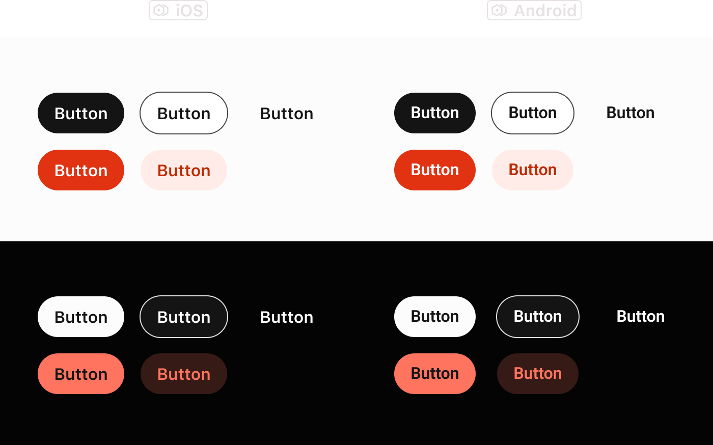
At ServiceTitan, we support three distinct mobile apps, each catering to different user groups. These apps are available in both light and dark themes, and are designed for both iOS and Android platforms.
Adopting Native OS Font Styles
We recently decided to adopt native OS font styles, presenting an intriguing challenge for our mobile design system in Figma. This change required thoughtful consideration of how designers would adapt to the new typography standards while maintaining a cohesive design across all platforms.
Aligning Our Applications
To bring our three applications into closer alignment, we embarked on a simplification initiative. The first step was refining our color palette, opting for black as the primary button color. This simplification not only reduced the number of button variations but also enhanced the overall polish of our components.
Outcome: Streamlined and Polished Design
Through these efforts, we achieved a more streamlined and consistent design across our mobile apps. The alignment of themes and adoption of native font styles have resulted in a more cohesive user experience, while the simplified color palette has improved the visual appeal and usability of our components.
In addition, our engineers were also able to reference the new Figma variables which matched their coded variables, creating a seamless handoff process.
An iterative approach
Step 1: Establishing a New Figma Library
To kick off the project, we built a new Figma library designed around a versatile variable system. This system utilizes aliases, allowing us to support three distinct themes with both light and dark modes for each.
Step 2: Porting and Enhancing Components
We meticulously ported each component to the new library, updating them to leverage the new variables for colors, font styles, and spacing. This transition also provided an opportunity to ensure each component was equipped with the correct iconography, button styles, and necessary functionalities.
Step 3: Simplifying Component Variants
For components like the segmented control, we streamlined the number of available variants, significantly reducing complexity. This alignment with actual product usage resulted in fewer variants to maintain and minimized the potential for errors.
Next Steps: Adoption and Documentation
As we move forward, designers will begin using the updated components and library for all new designs. We will also focus on thoroughly documenting our components and patterns to drive consistency across applications and enhance the overall design process.
Outcomes
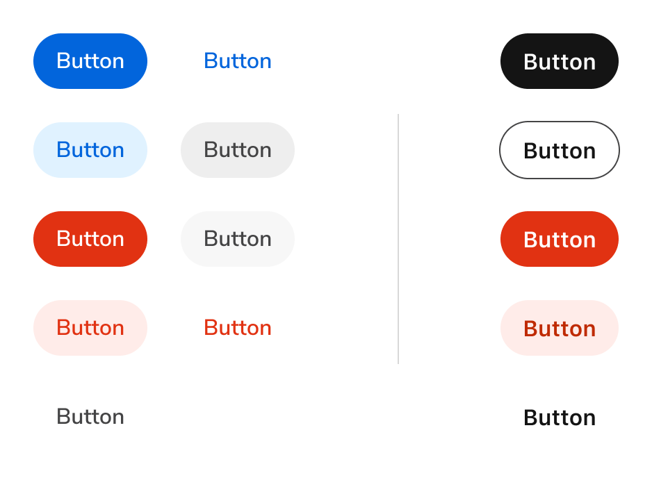
Button simplification
New Button styles resulted in a simplification of options, from 9 to 5 options.


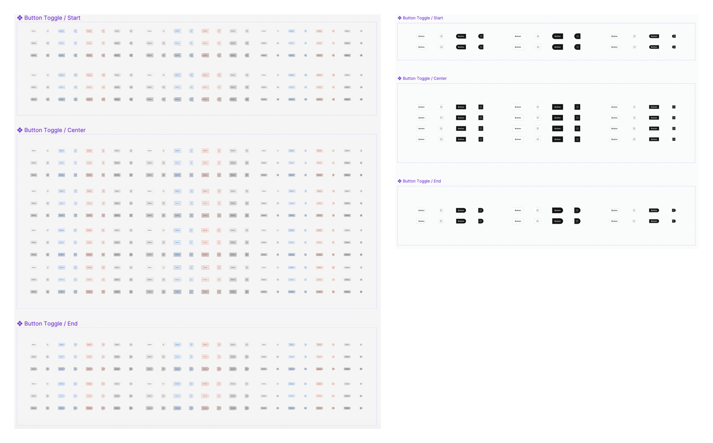
Before and after of Segmented Control (Button Toggle)
By changing our primary and secondary button colors and leveraging usage data, we were able to significantly reduce the number of variants for the Segmented Control component.
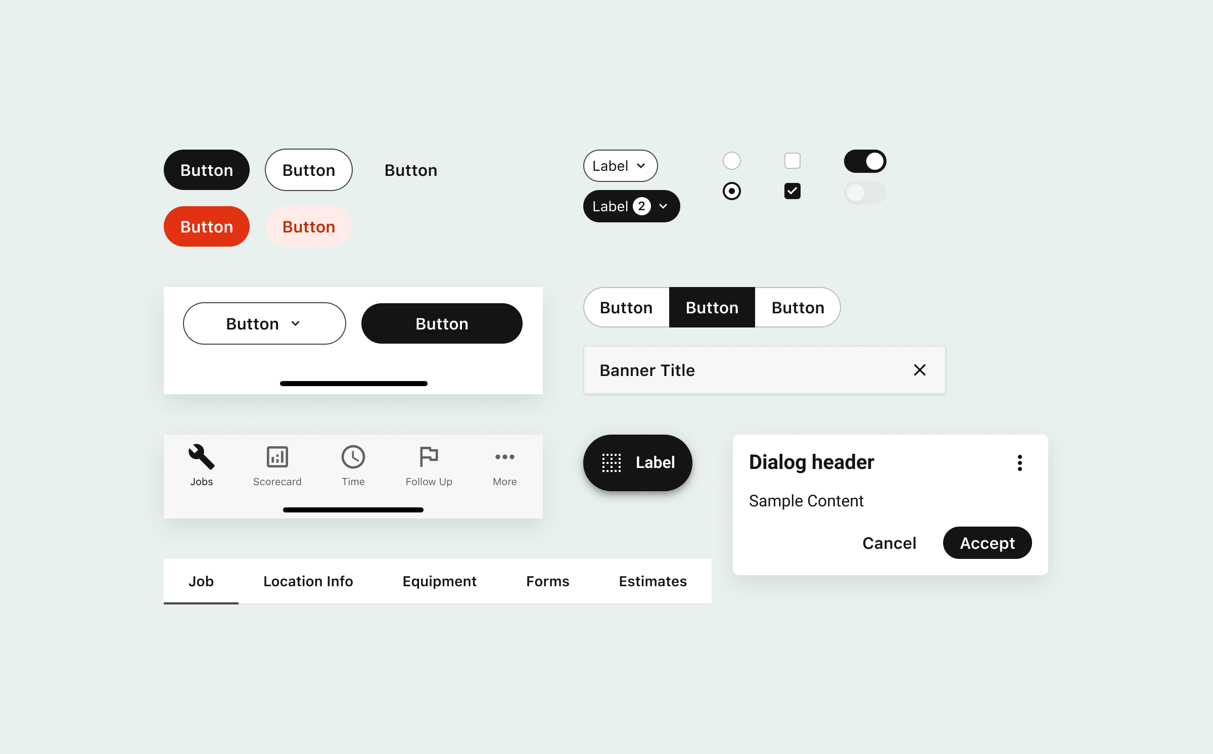
Downstream enhancements
New styles and variables allowed us to make small enhancements to existing components. The Android Dialog was enhanced to have a stronger point of view and clearer primary and secondary options through the new design language.

